
Every Client Lounge portal is made of blocks — modular elements you can arrange to build your ideal client experience.
In this guide, we’ll go through every available block, what it’s for, and how you can use it to make your portals more informative, visual, and engaging.
If you haven't already, we recommend reading our guide "Creating your first portal" to get yourself familiar with our portal editor.
Blocks library
Client Lounge portals are built with blocks: flexible components you can combine to create any kind of client experience. Let’s look at what each one does
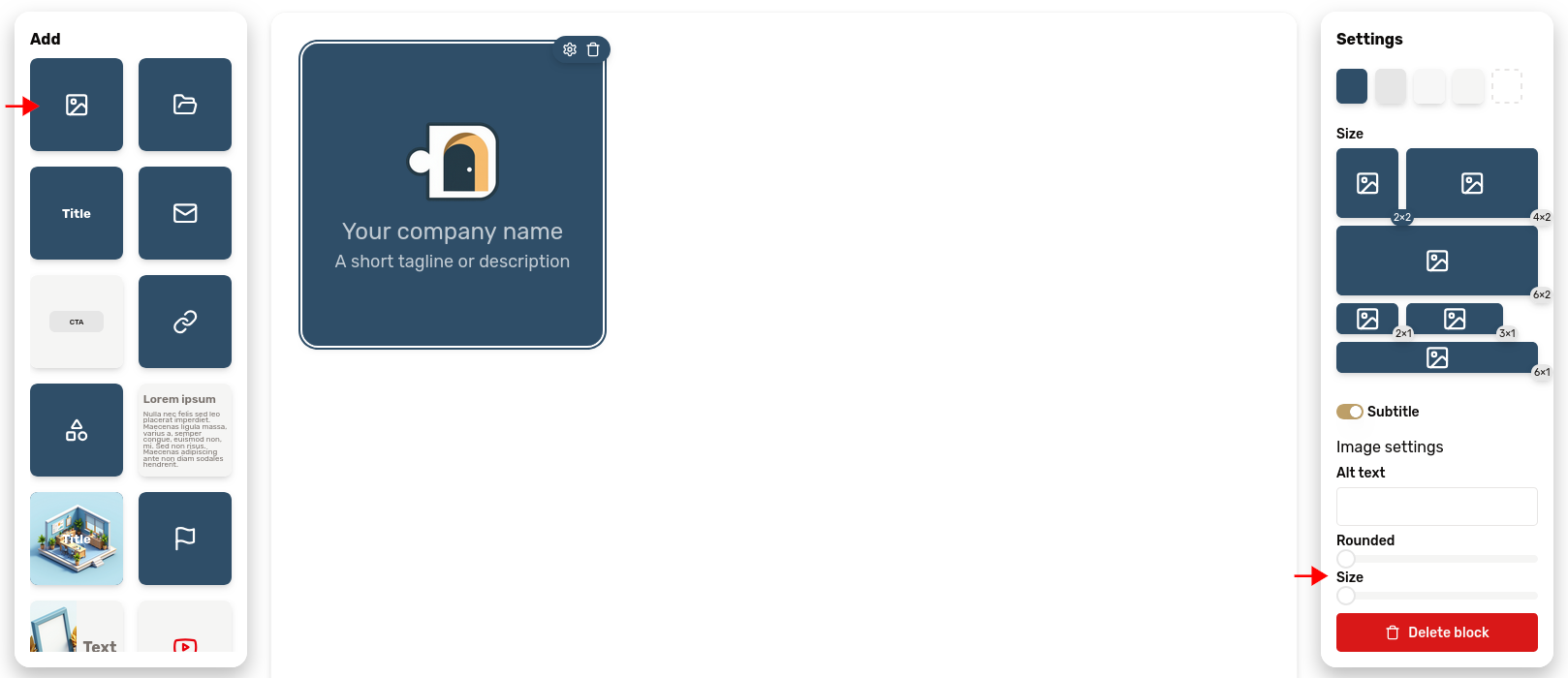
Logo
The logo block is represented in the "add block" palette by a "picture" icon. It lets you upload your logo to present your company. Click the Client Lounge logo to replace it by your own, or simply drag an image from your desktop.
In the block settings, you will find two sliders:
- one to control the roundness of the image corners. Set it at the maximum to get a circular image.
- the other one to control its size.
Directory
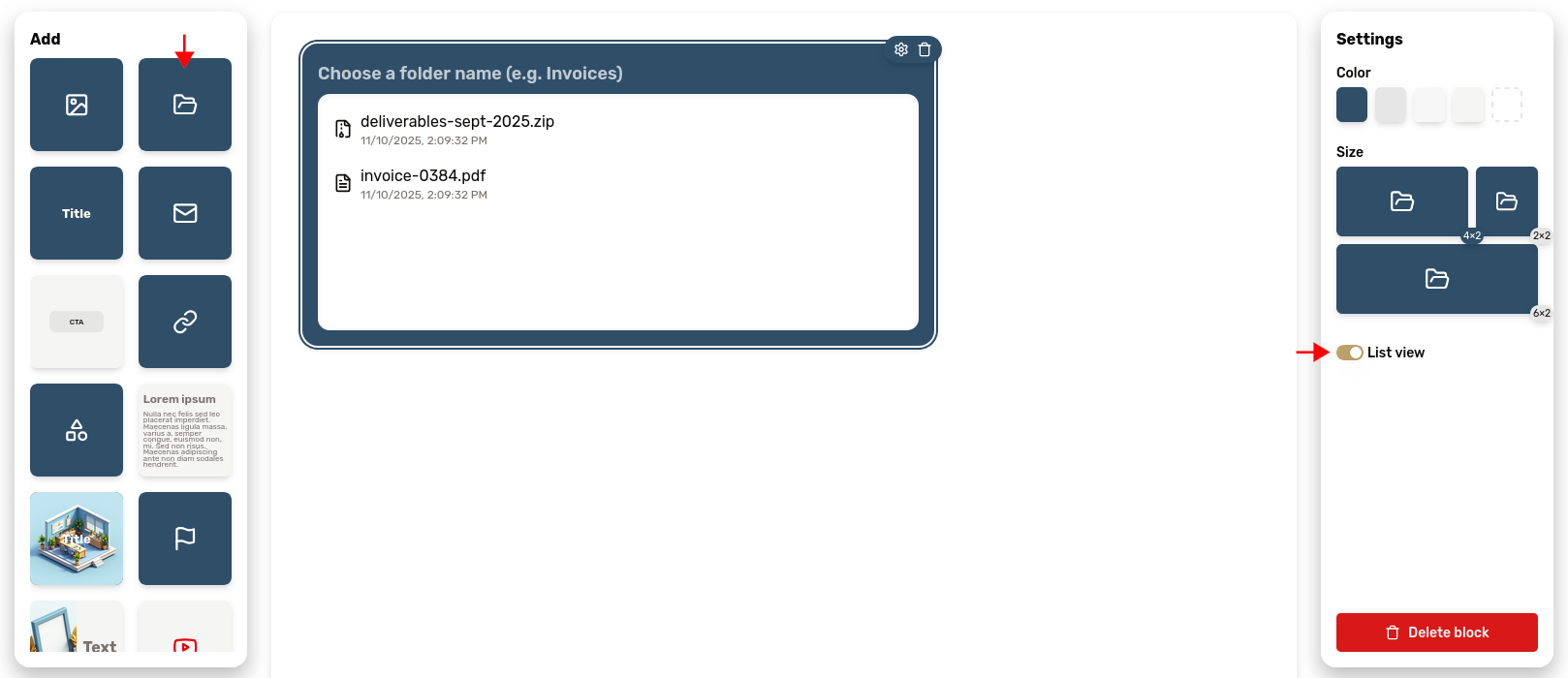
The directory block is represented by a folder icon. It lets you securely share files with your customers.
Its settings expose a toggle to switch between a detailed list view and a simpler grid view.
Learn more about file sharing in our dedicated article
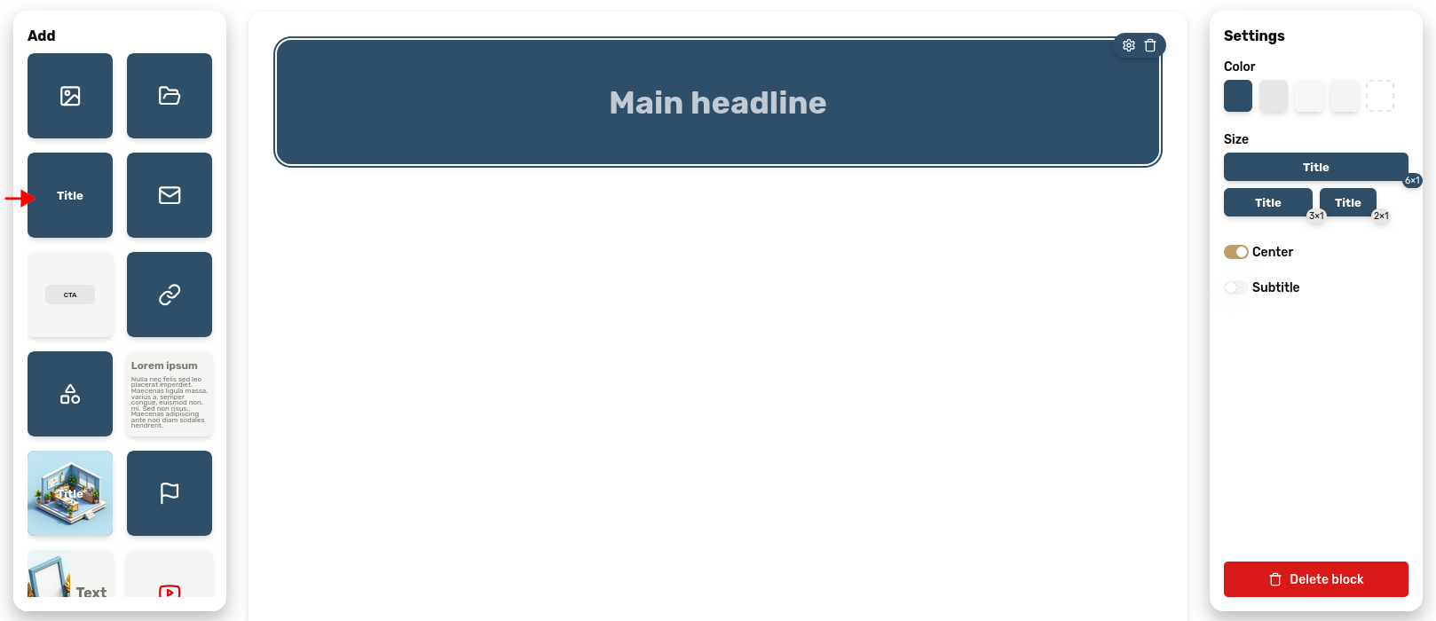
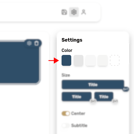
Title
The title block lets you insert a title with an optional subtitle. It's useful to create clear sections in your portal layout.
Two toggles are exposed in the settings:
- one to switch the centering of the text
- the other one to enable or disable the subtitle
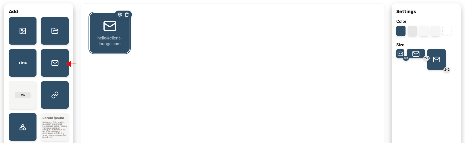
The email block lets you give your customer a simple way to contact you. Just type in your email and you're set. Your clients will be able to write you an email by just clicking the block.
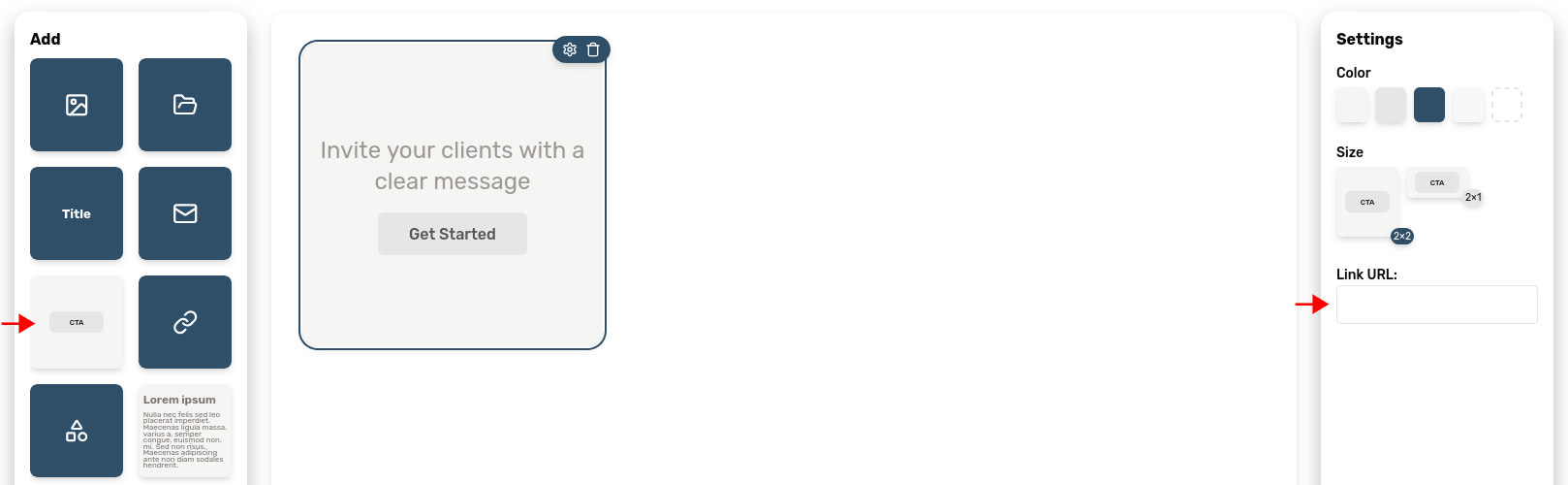
Call-to-action
The call-to-action is used to display a button. You can customize the label on the button itself as well as the text on top of it.
It can be used to encourage your clients to access a link.
Use the field in the settings to set the button's target URL.
Link
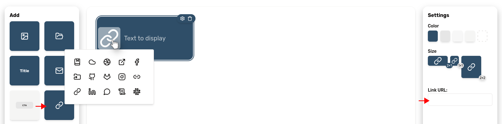
Need to insert a link to an external resource? This is the purpose of the link block, represented by a chain link icon.
You can customize the accompanying text and the icon. Click the icon to change it.
Use the field in the settings to set the button's target URL.
There's also a switch to toggle the "embed mode". Activate it so the content is opened inside your customer portal for a more integrated experience!
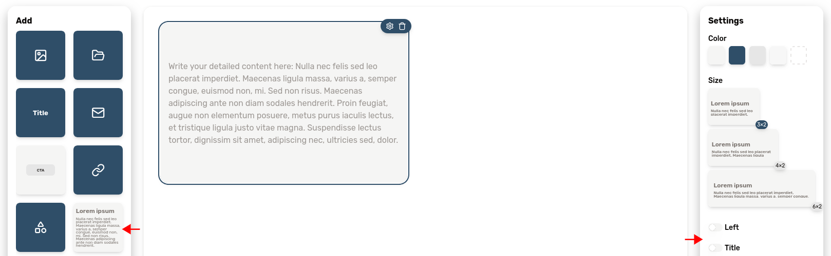
Text
If you need to write a big chunk of text, this is probably the block you're looking for. It's really useful if you want to include a long description.
It exposes two switches in the settings panel to customize the text alignment and optionally insert a title.
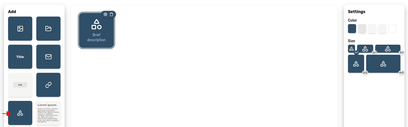
Icon
The icon block is useful to structure your portal layout in a visual way. It lets you insert an icon of your choice (you can pick it by clicking the current icon), with a small piece of companion text.
This block can be added by clicking the basic shapes icon in the "Add block" palette.
Banner
The banner block can be thought of as an alternative to the "title" block. It lets you add a title over an image of your choice. Hover over the block to reveal an image upload button.
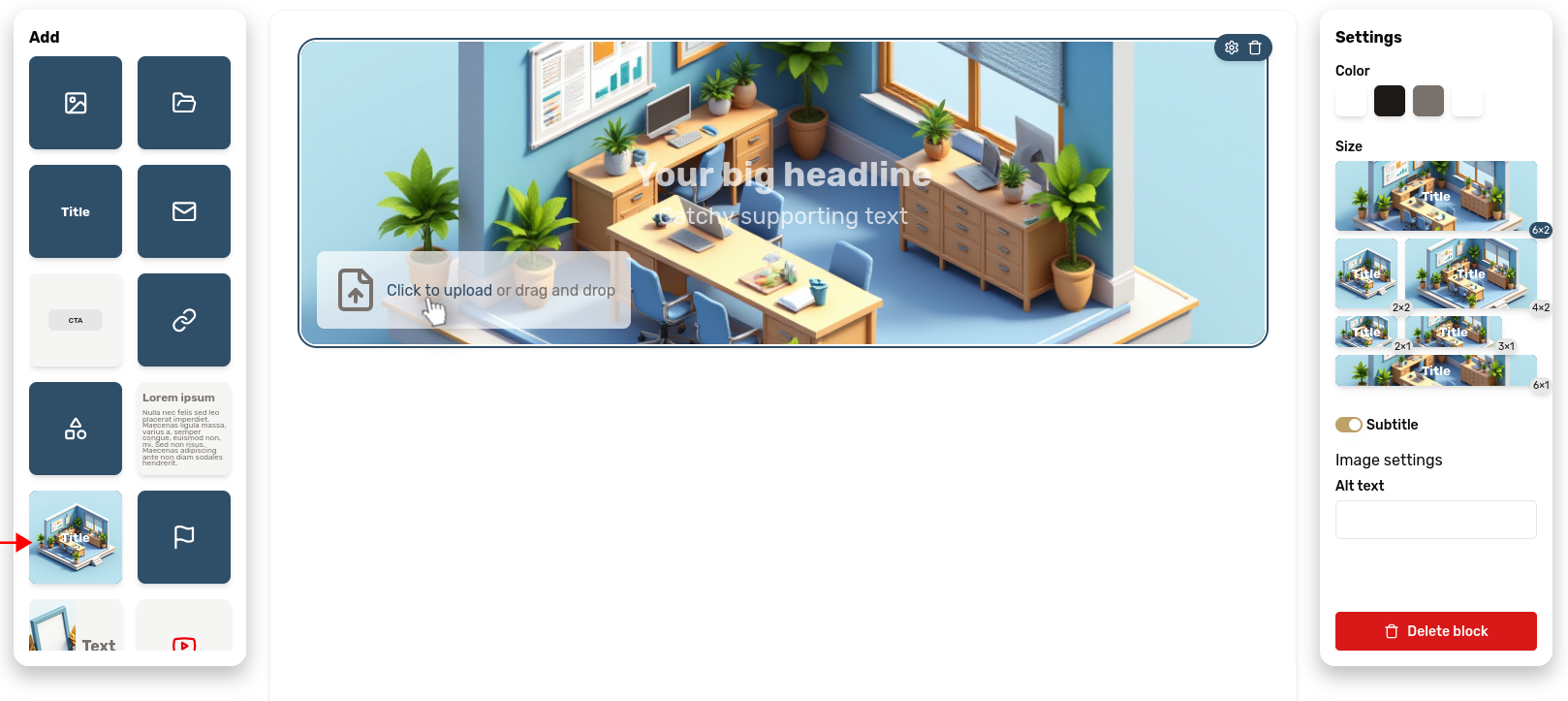
➡️ Great for welcome messages or project introductions
Text + Image
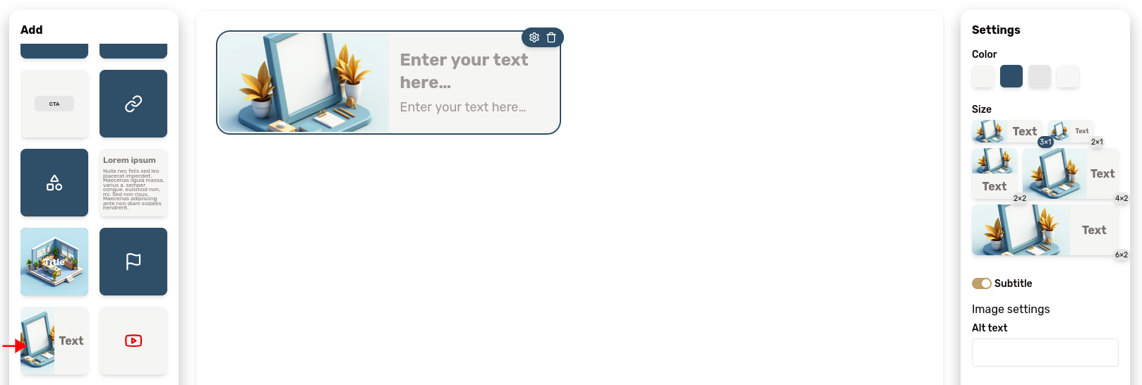
Use this block to display an image and some text side-by-side.
The subtitle can be disabled from the settings panel.
➡️ Perfect for team bios or case study summaries
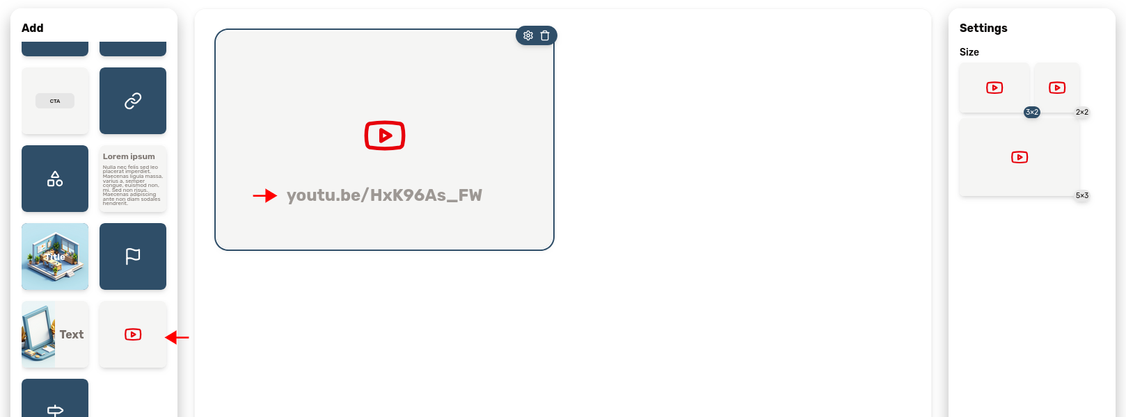
Video
Videos can be really game-changing for customer engagement and onboarding. We let you insert videos hosted on YouTube to your portals. To do so, just include a video block, represented by a YouTube icon, and paste the link to the YouTube video.
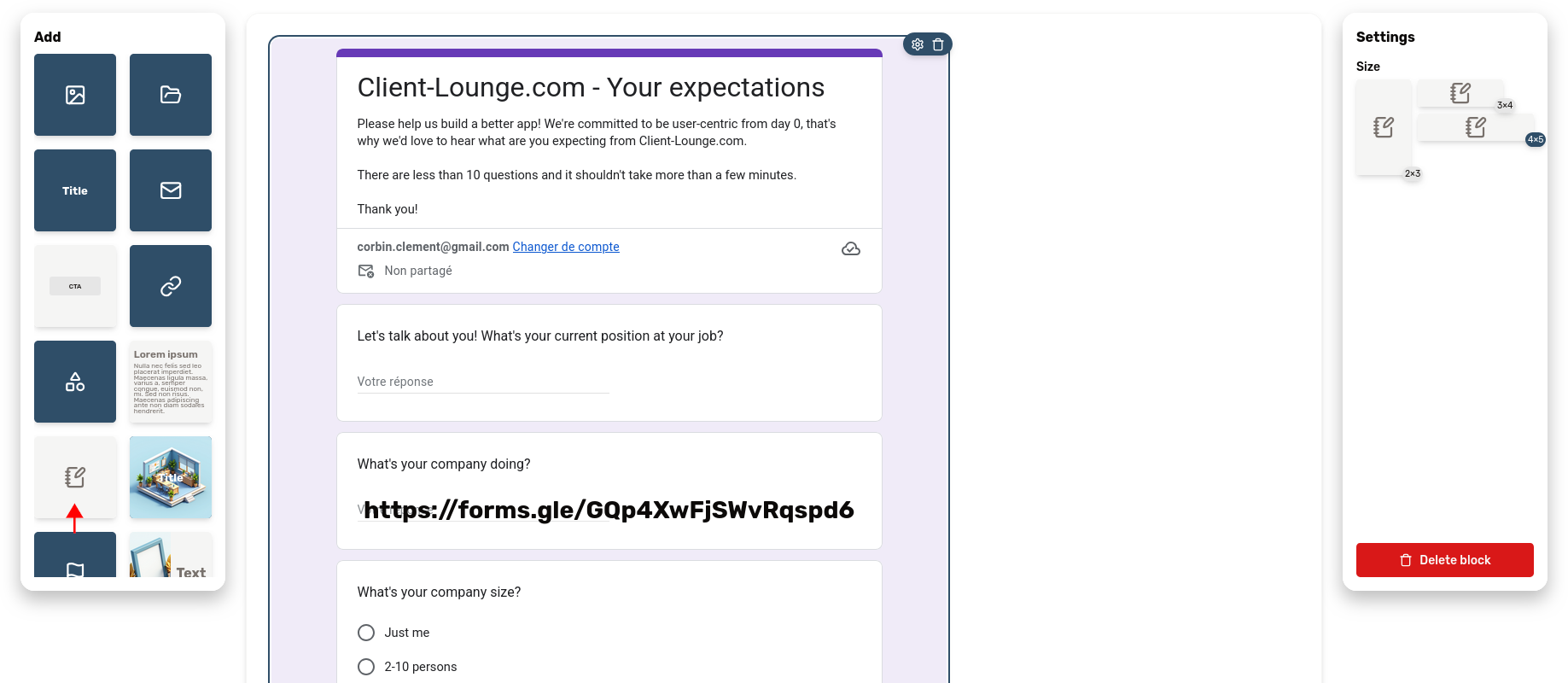
Embedded content
The "embedded content" offers a generic solution to integrate 3rd-party content within your portals: forms, documents, etc. Just paste the URL of your content and it will appear here.
For example, you can use this block to insert forms from Tally or Google Forms to ease onboarding.
Project phase
The project phase block is particularly useful to let your customer know about the work you're doing, without the confusion of giving them access to the intricacies of your project management tool.
Add it by clicking the "flag" icon. It comes in several variants (numbered phase, with an icon, with the text on the side, etc.), so feel free to check them out to pick the one that suits you best.
One can also enable or disable the date feature of this block, which is useful to make sure everyone is on the same page about deadlines. If you want to let the customer pick a date instead of you setting it, you can do so with a toggle switch in the settings.
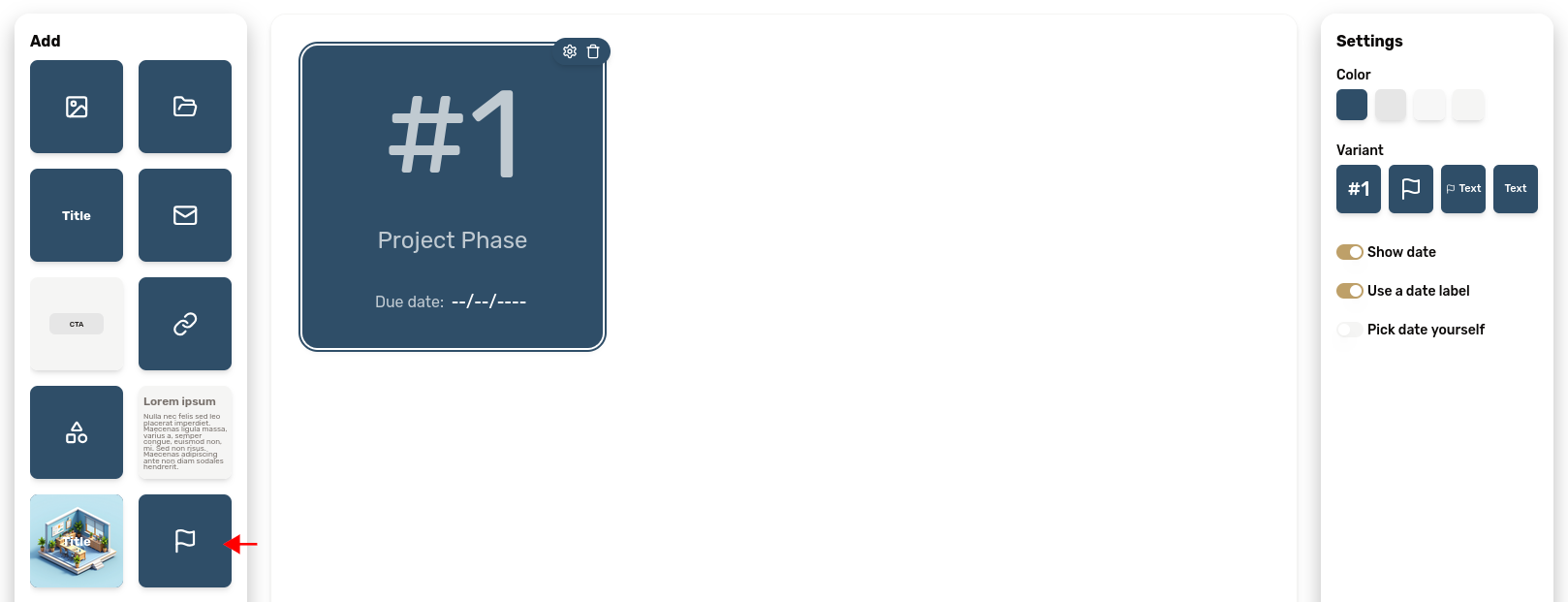
➡️ Ideal for showing progress or project timelines
Project step
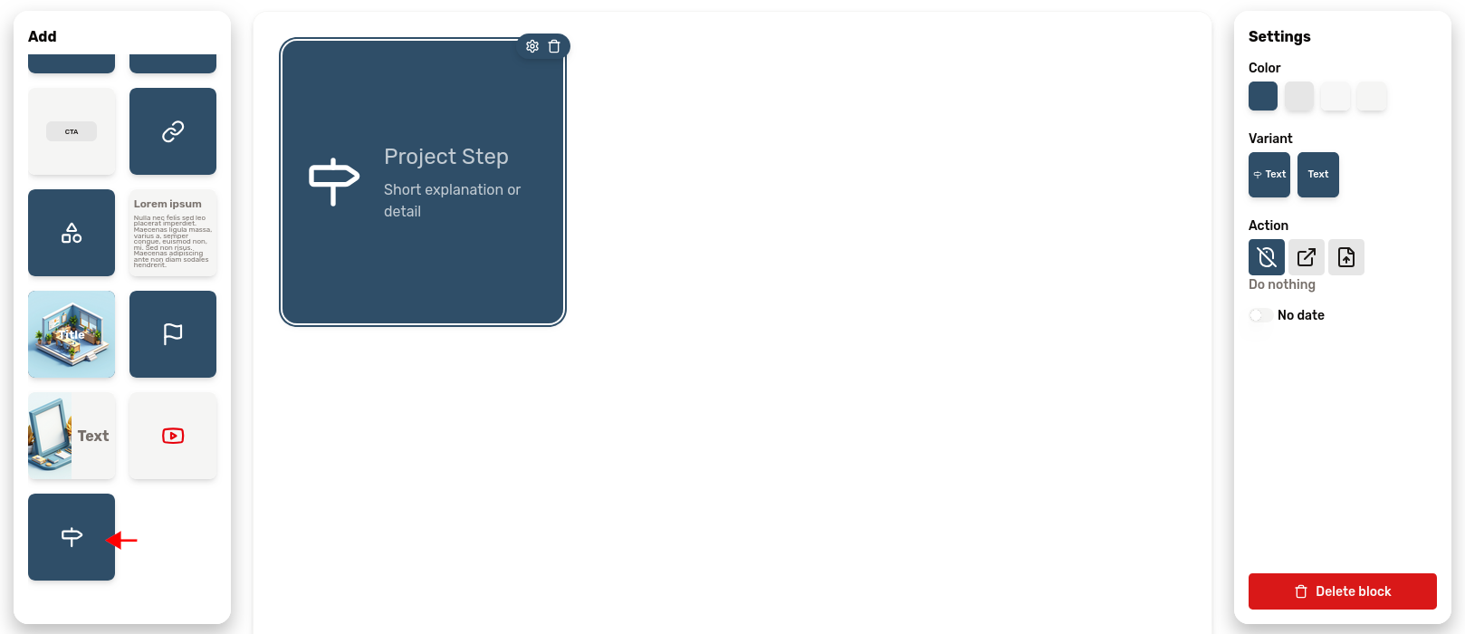
The project step block, symbolized by a roadsign icon, serves the same purpose as the project phase block, but for more detailed workflows.
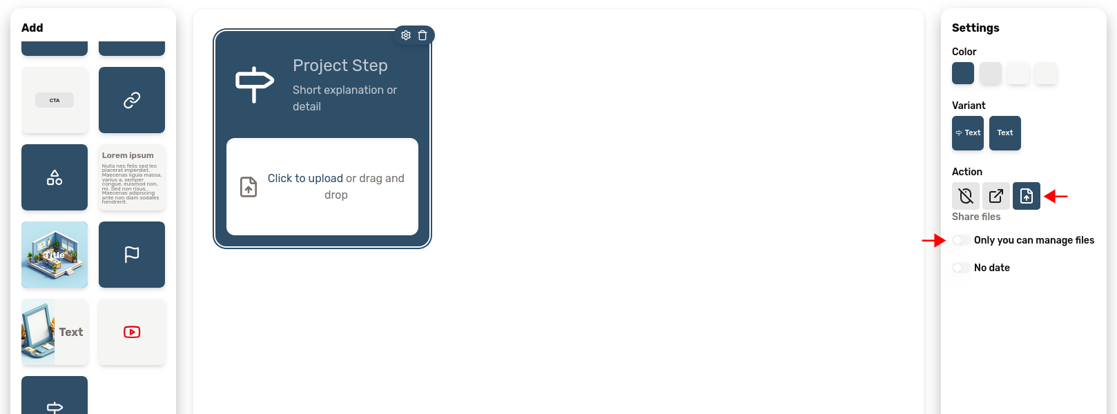
One can assign an action to this block. It can be a button to trigger a link, or a file download.
This block also shares the date feature with the project phase block.
In particular, if the "file" action is chosen in the settings, you will be able to share files with your client with this block. This is quite useful for sharing files associated with a certain step of one's workflow, such as deliverables.
The settings panel also offers the option to let the customer upload files, in order to gather documents from your customer. A must-have feature for onboarding.
Similarly to the "Link" block, when you chose to target a URL with this block, you can choose to open the content inside your customer portal rather for a more integrated feel.
...The missing piece
You need a block we haven't thought of? No problem, just tell us about it! The portal editor includes a "feedback" button in the menu for this purpose. Otherwise, you can just send us an email at feedback@client-lounge.com and we'll do our best to make it happen!
Block appearance
Now that you know each block, let’s look at how to style them.
The settings regarding each block appearance are the same for all block types. These let you customize the size and color of each block.
Block colors
Each block offers 5 color variants, you can use them to create a visual hierarchy within the portal:
- Primary
- Secondary
- Card
- Muted
- Transparent
Click a color to apply it to the block. Use bright or primary colors for emphasis, and muted tones for background or secondary information.
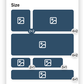
Block size
You can also choose the size of any block. Depending on the type of the block, not all size options may be available. Each button represents how much space the block will occupy on the portal.
Click one of the size buttons to change the size of the block.
Once you know which blocks to use, you can structure portal content with confidence and adapt layouts to any client.
By combining these creatively (adding visuals, calls-to-action, and structured information) you can design a portal that looks great and strengthens your client relationship.
Try experimenting with layouts and colors, and remember: you can always modify, resize, or remove any block later.